When it came to designing the cover for Ark of the Gods, book two in the Sean Livingstone series, I thought all the hard-earned lessons were behind me. I was wrong. Combining everything I wanted to see on the cover without overloading the illustration was a challenge from the very beginning.
See my article Designing A Book Cover & Hiring An Illustrator for a full breakdown on the creative process for book one, Crown of the Pharaohs. The illustration for that cover seemed to fall together a lot easier than this one.
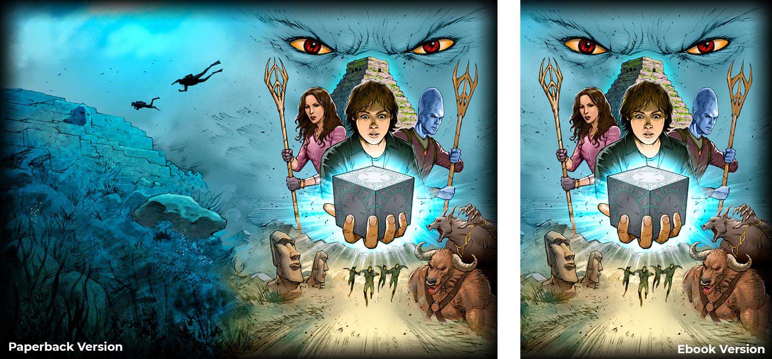
There were some upsides though. Being book two, there was a clear design style already established. The type of illustration, font choices and layout would remain consistent, however this time I would create the full wrap-around version for the paperback from the start, then extract the ebook cover from that.
I hired Wayne Nichols again, the incredible illustrator for the Crown of the Pharaohs cover, so there was a short-hand to our communication this time around.
Balancing The Illustration
My first step was to create a mock-up of the cover in Photoshop using various images sourced from the internet, something I could send to Wayne to get him started. I wanted a blue colour scheme to Ark of the Gods, something that would tie in with the water-based themes of the story and differentiate it from the warm orange tones of the first book.
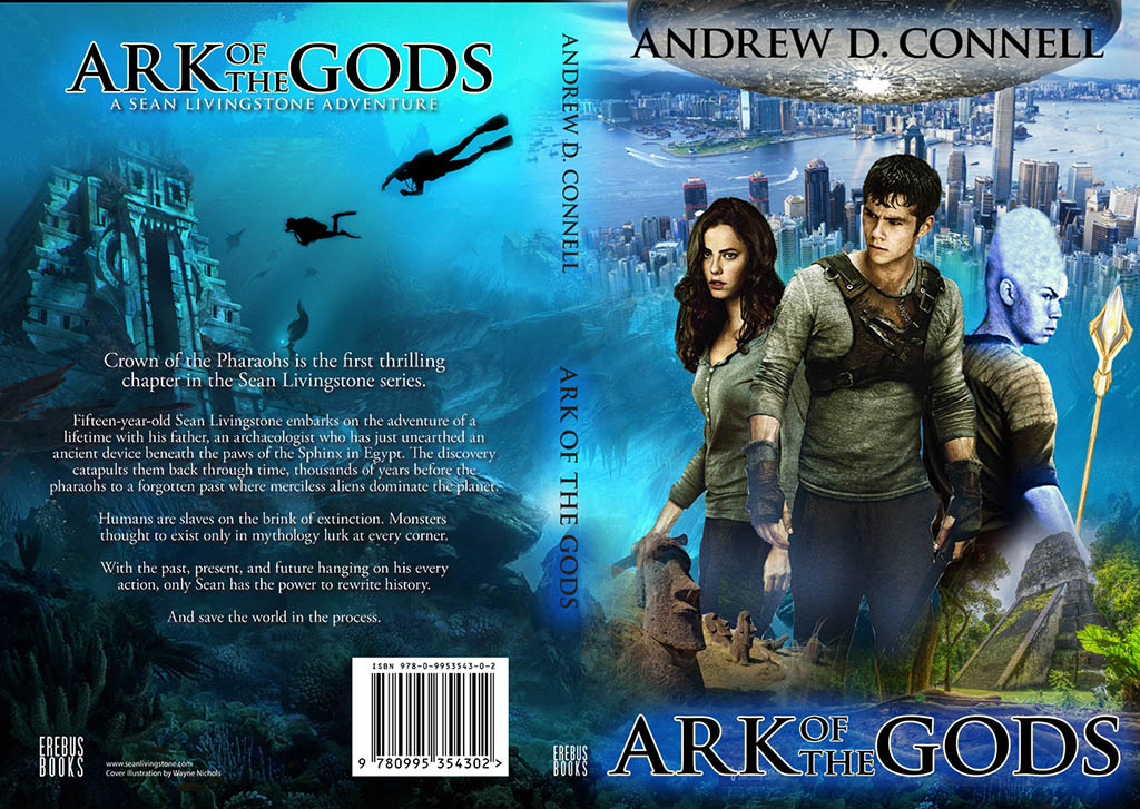
I wanted the three main characters, Sean, Nocao and Bella to be featured front and centre, while also promoting the exotic locations visited in the story. The rear portion of the cover featured an underwater pyramid with plenty of nondescript space to add the synopsis, bar code and other necessary elements.
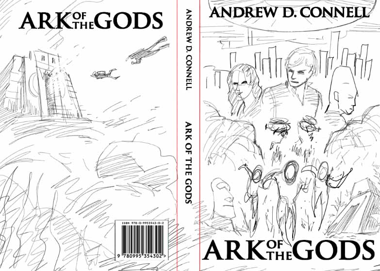 Wayne created a rough sketch based on this layout with the addition of some action elements in the front centre. This included the main characters running, chased by helicopters and alien vessels. In this version we also tried to include the alien invasion in the top half of the front cover, but as Wayne suggested, the image was getting too busy.
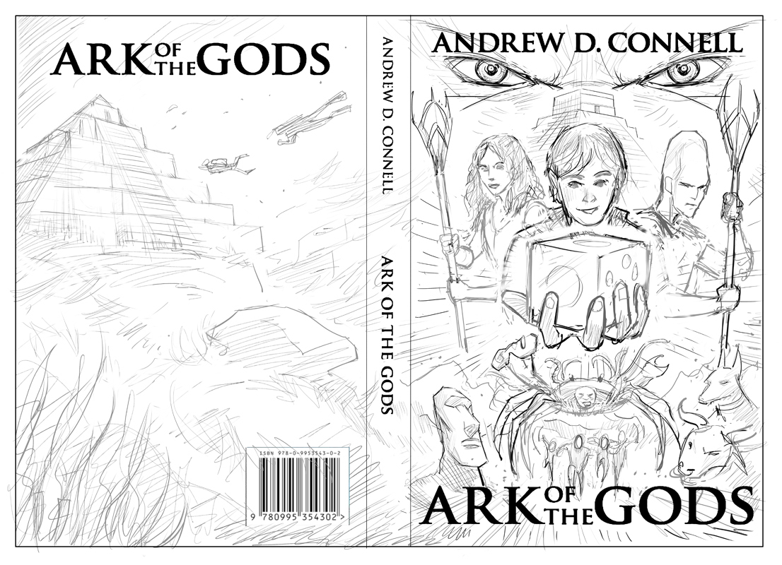
After evaluating this design for a while I realised the first mock-up was missing the hybrid monsters and too focused on the action elements. The Easter Island moai, Mayan temple and underwater locations also needed a shuffle to improve the balance.
For the second Photoshop mock-up I shifted the Mayan temple toward the rear-top, and placed Senetep’s eyes looking down upon our main characters to create a sense of foreboding and menace. I also added an anubis hybrid to the lower right, with the intention of adding extra monsters later.
The biggest shift was the focus on the alien cube in the front-centre. Although Sean wasn’t looking at the cube in this version, the intention was to have him looking down and grasping it in the final illustration.
The cube gave the cover a central element that tied everything together and created a nice symmetry. The characters weren’t featured in their exact poses, especially Sean, and were only there to give Wayne an indication of size and positioning.
The next sketch went into monster overload. I wanted to throw everything into the mix, but there were too many creatures and the whole design was feeling really cramped.
This version was based solely on the directions I gave Wayne (I’m sure he was rolling his eyes at this point!), and as soon as I saw it I realised I needed to pull back some elements and focus on the cube.
Up until now, the rear cover had not changed at all. Other than a few necessary tweaks to the underwater structure, I knew it wasn’t going to change that much, I just needed to get the front balance correct.
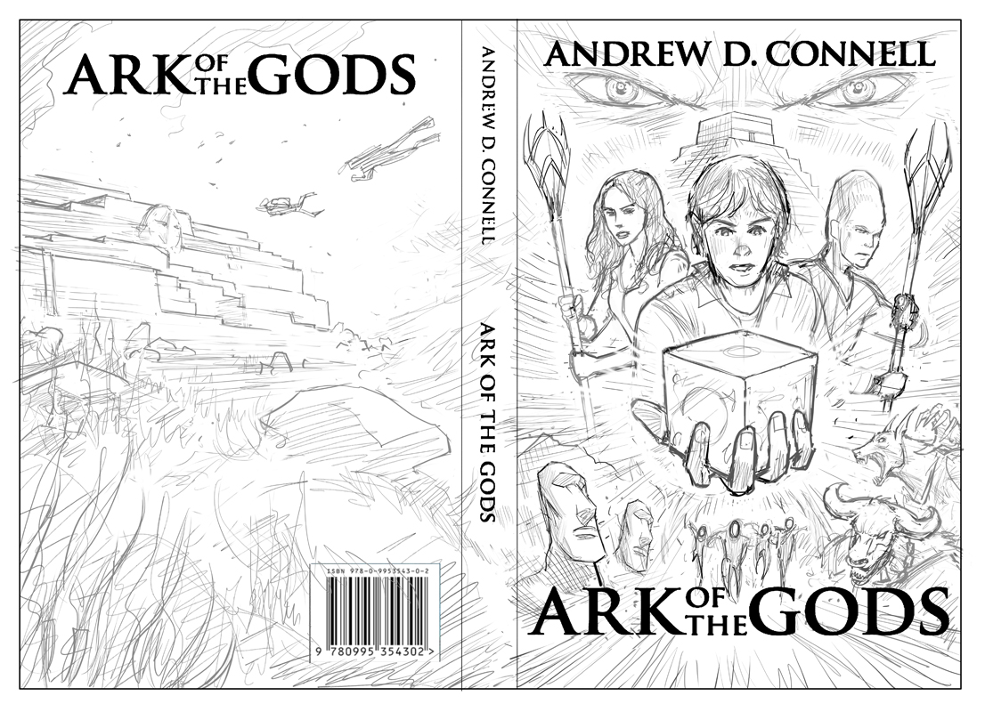
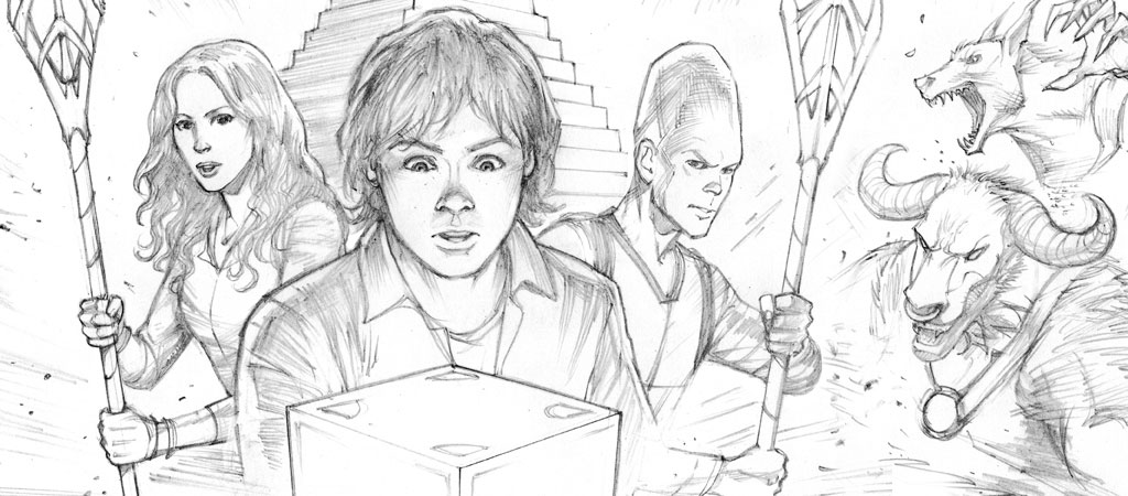
By the third rough sketch we had nailed the layout. The giant crab hurling a moai was removed, allowing the cube to be lowered so Sean could look at it without it looking like it was being shoved in his face. The minotaur and anubis were drawn closer to their final poses and the remaining elements were sized to their final proportions.
The rear cover finally received some love as well. The underwater pyramid was altered to a tiered rock structure and detailed more in line with the actual story, notice the suggestion of a human face carved into the stone.
With everything in place, Wayne moved onto the final pencils, the last stage for my approval before we proceeded to colouring.
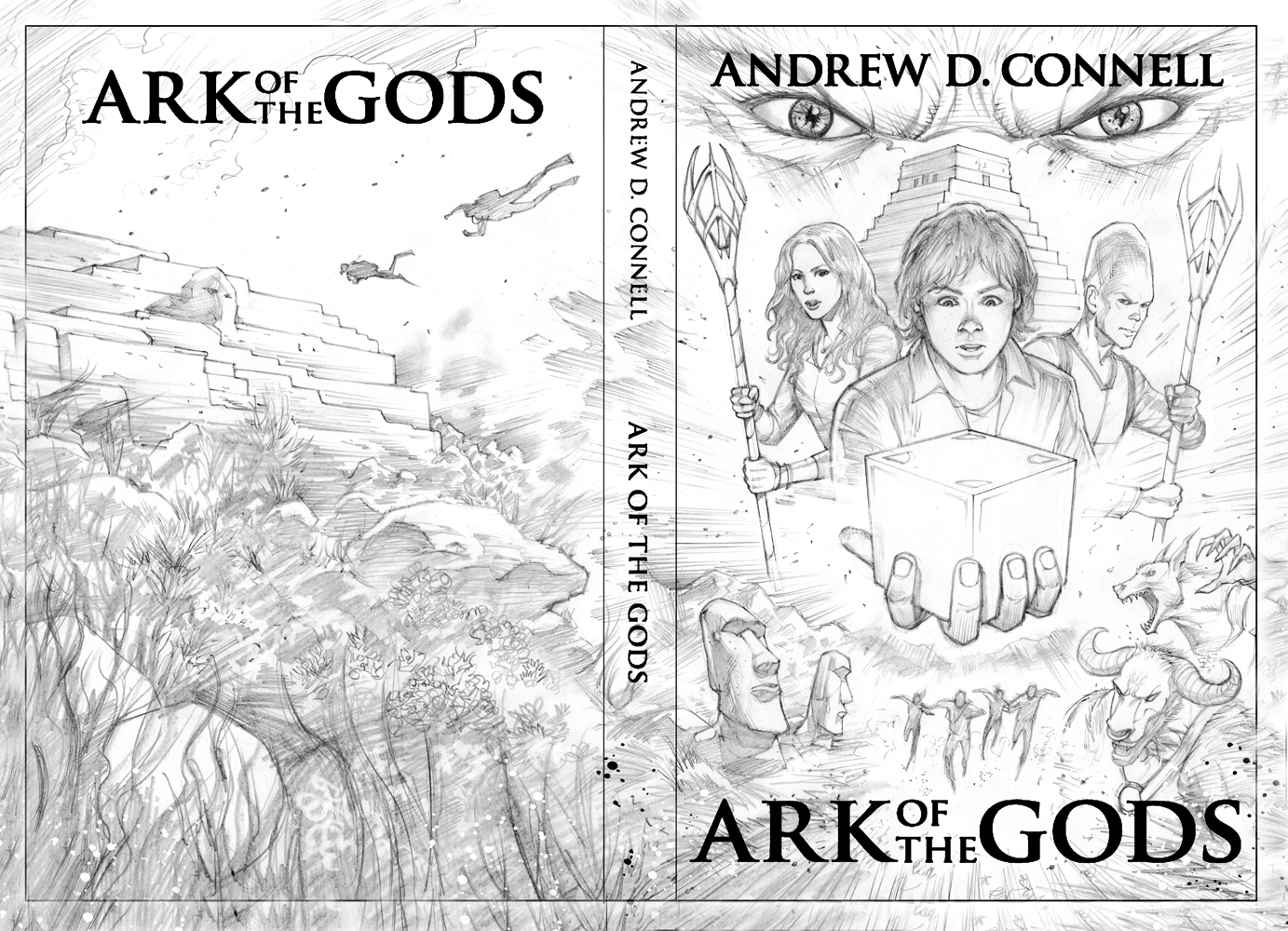
At this stage all the elements were drawn as they would appear in the final cover, with attention to detail and shading. The only thing unfinished now was the cube, I was still trying to figure out the exact detailing for the three sides.
Adding Some Colour
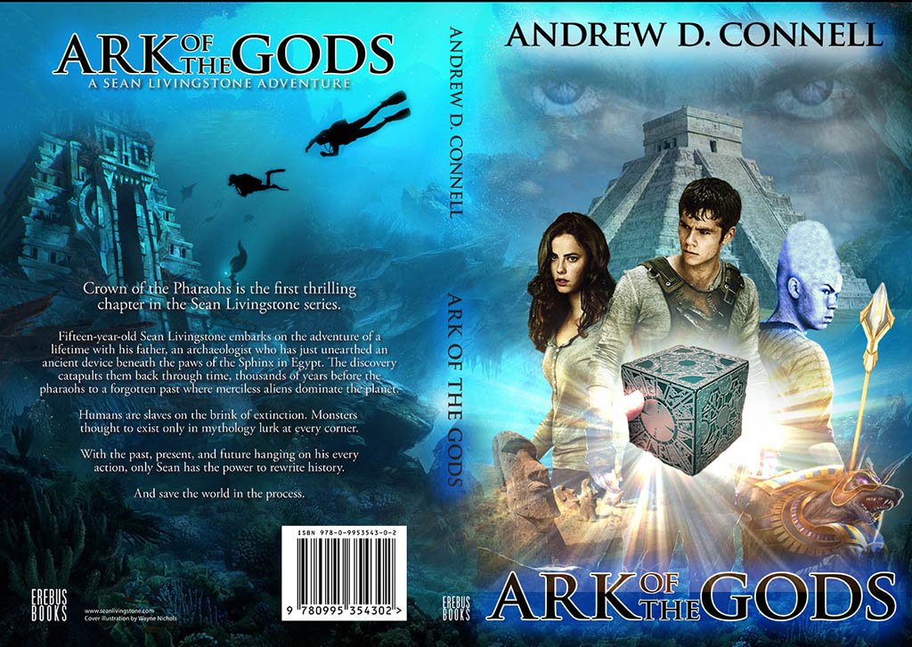
The cover takes on a whole new life once colour is added. Wayne begun by laying down a very simple base layer, which he built upon in stages, constantly adding little details, flourishes and highlights. Every time I thought he was close to finished another version with would arrive in my inbox, surprising me at how much work Wayne put into the colouring.
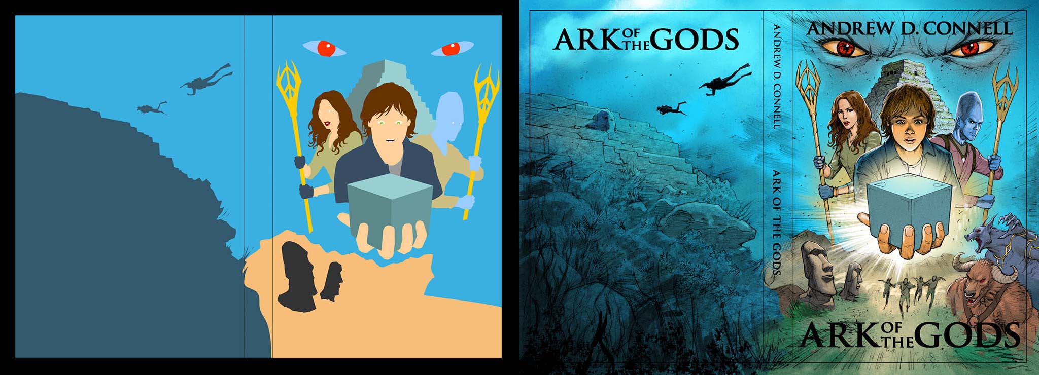
Some of the changes between versions included revising the overseeing eyes from red to blue and blending them into the background, creating beams of sunlight on the rear upper third of the cover, and dimming off the edges of the entire image to make it darker.
I thought the dark edges would work well, but when the front cover was isolated for the ebook version and shrunk to thumbnail size it looked a little weird, almost unfinished. The dark edges dominated the top, right and bottom sides, but the spine remained lighter, an unfortunate side-effect of using the wrap-around cover for both versions of the book. It just didn’t match.
For the final colour revisions we removed the black edges and enhanced the light sources for the cube and the beams of sunlight on the rear cover.
Title Design
I tried several layouts for the ‘Ark of the Gods’ title. The hardest part was deciding how to position the ‘Of The’ in between ‘Ark’ and ‘Gods’. I tried several layouts, but the design was more pleasing to the eye when the entire title was on one horizontal plane, rather than splitting it between two.
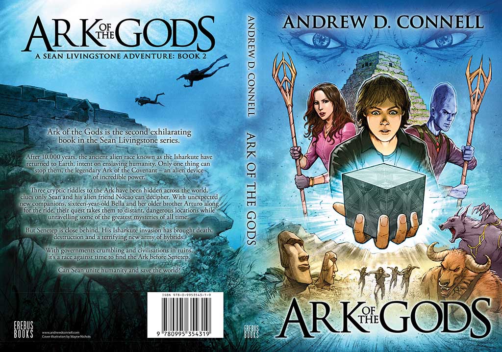
The text layout was fairly straight forward from there. I kept all the fonts black and as simple as possible, avoiding any kind of stroke or inner colour that might clash with the illustration. A soft outer glow was added to the title, author name and rear cover synopsis to separate those elements from the background.
Designing a book cover is a constant juggling act, allowing enough space for the text without compromising on the overall design. I have a tendency to fall in love with the illustration, therefore I favour it a little more over the book title and author name. But that’s the great thing about self-publishing, you have complete control over all these artistic decisions.
For those of you interested in illustration, Wayne Nichols uses Adobe Photoshop with his Wacom Cintiq 22HD.