 Designing the covers for my books is one of the most enjoyable aspects of the entire self-publishing adventure. It’s a culmination of all those months, sometimes years of work.
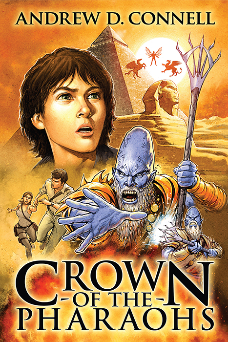
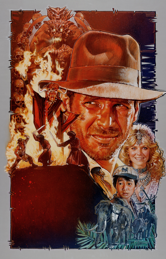
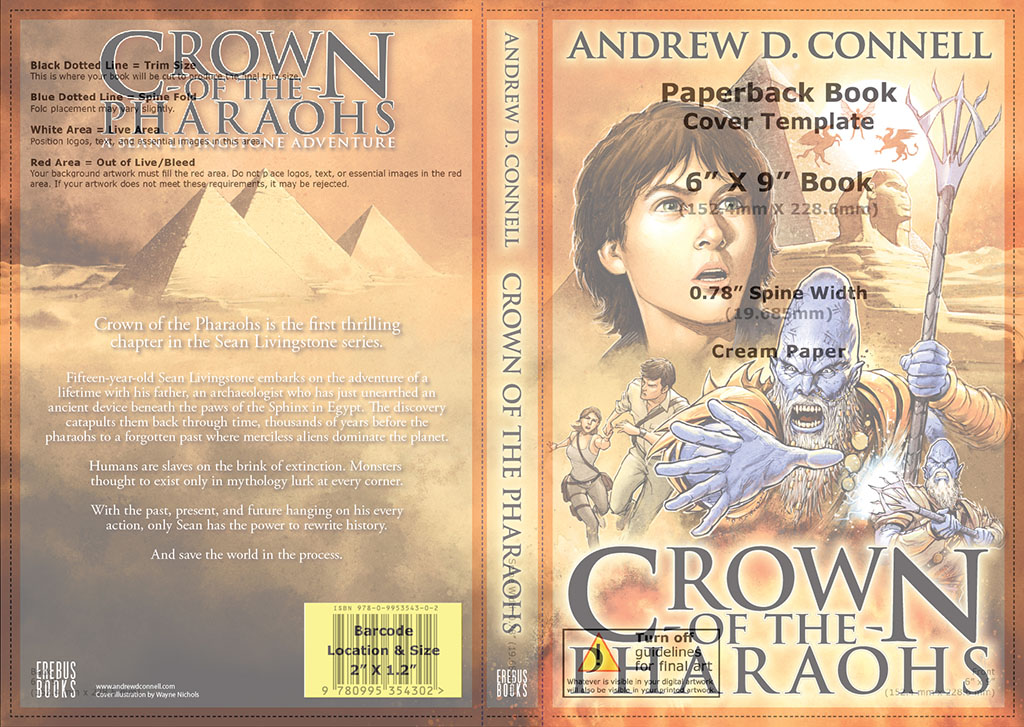
From the very early stages of designing a cover for Crown of the Pharaohs I knew what look I was going for, a throwback to the style of Hollywood poster artist Drew Struzan. Drew created iconic posters for Indiana Jones, Star Wars, Back to The Future, Big Trouble in Little China, The Thing, Harry Potter, and the list goes on. This style appealed perfectly to the young adult demographic my novel was targeting.
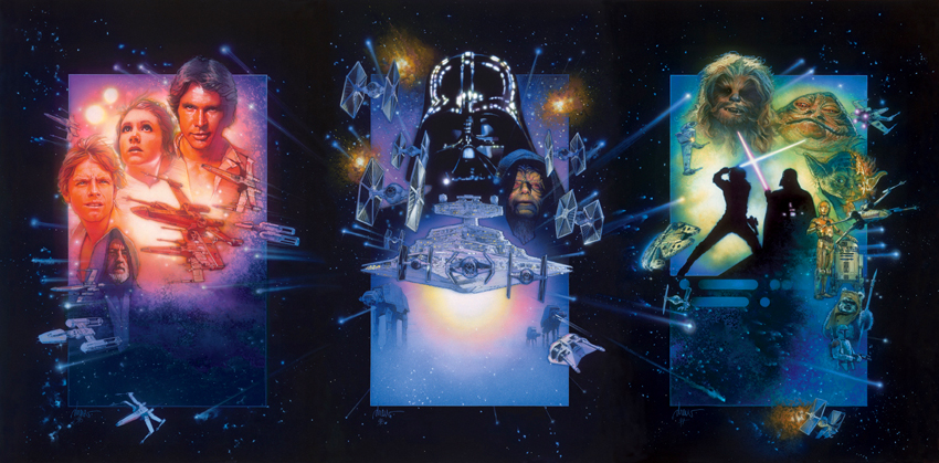
The Struzan collage style of composition also lends itself well to the action, adventure and science fiction genres. In one image, his posters capture the sense of excitement and wonder that makes you want to see the film. That’s exactly what I was trying to achieve with the cover, but it’s not a look that’s easily achieved or replicated and trying to find an artist who could create something in a similar style was a challenging task.
Finding & Hiring An Illustrator
I didn’t know any local artists, let alone illustrators, who could create the classic Struzan look from the initial concept to the final artwork. In the end I resorted to searching the internet for illustrators who had created something similar to the style I was looking for. After a couple of days of searching I realised there weren’t many, but was fortunate to come across Wayne Nichols, an Australian comic book artist who illustrated titles for Marvel Comics, Dark Horse Comics and IDW Publishing. There was a particular image on his website of a Viking that he’d created in the Struzan style. As a bonus, he was located in Australia. I reached out to him via email, pitched my idea, and was relieved when he agreed to come on board.
When negotiating a price for the artwork it’s also crucial that you confirm with the artist that you will own all rights to the image, allowing you to use it for other purposes like promotions, marketing and adding the image to your website.
Composing The Illustration
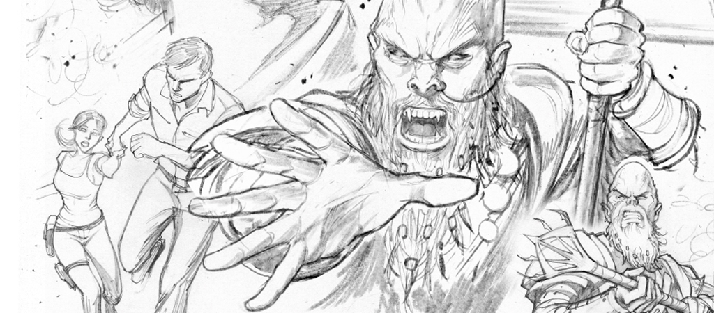
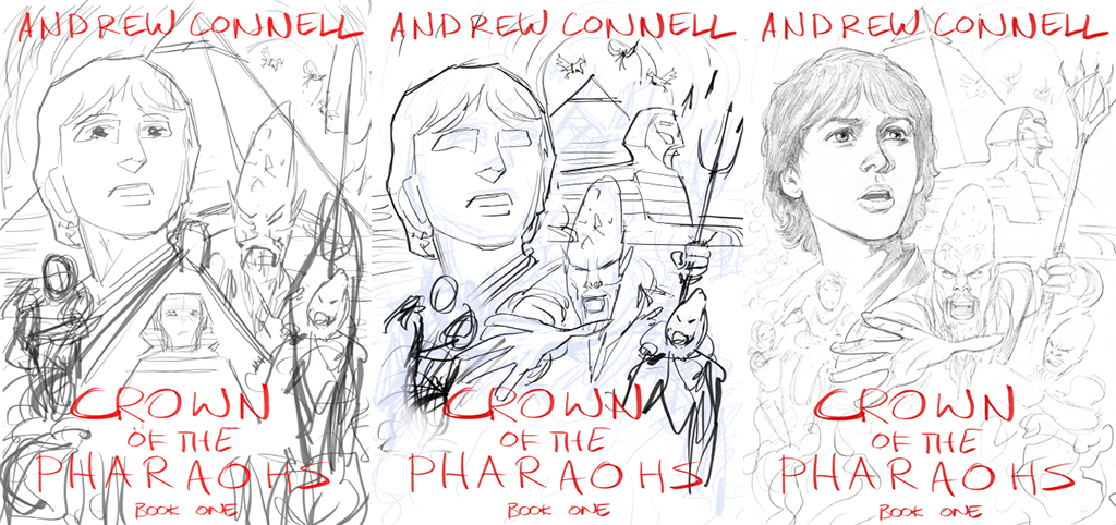
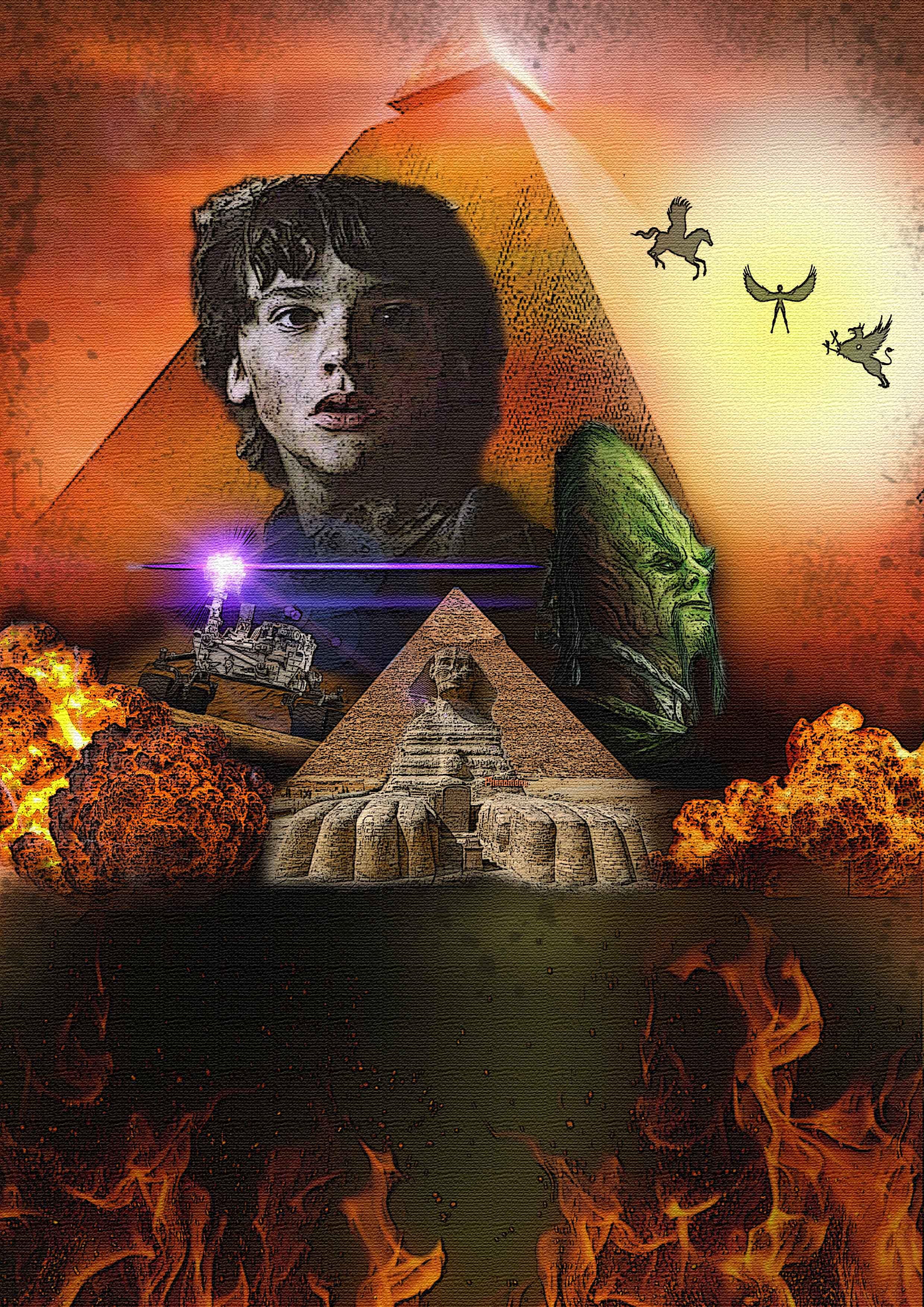 I’d already created a pretty basic mock-up of the cover in Photoshop, basically pinching images from anywhere to create the collage look. It was a good starting point for Wayne. His initial sketches were very rough drawings based on my mock-up, intended to position and size key elements of the image. For me, the main focus always needed to be Sean Livingstone, the teenage hero of the book. Unlike Struzan’s poster style, which was always based on real-life actors in the films, we had no reference for Sean, so Wayne had to base his drawings on my descriptions. I was very particular about catching Sean’s wide-eyed look of wonder and innocence, mixed with a hint of impending danger.
In the early roughs Wayne tried to incorporate all my elements, but some of them didn’t work. We re-positioned the Sphinx and removed the smaller pyramid behind it, along with the exploration robot.
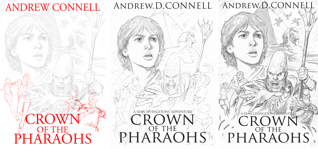
Wayne enhanced my main alien villain Senetep, placing him front and centre with a great action pose and threatening expression. We added another alien on the right of the image, also in an action pose, and replaced the robot with Sean’s dad Henry and his fiancé Carla. Now that all the elements were in the right place, we had to check that we’d left enough space for the title of the book and my name.
The next phase was moving onto the more refined pencils. This was when things really started to get exciting, the characters I’d seen in my head for years were coming to life in the art.
The colouring came in stages. We worked through each progression, making slight adjustments to colours as we went along. I was mindful about being specific, sending Wayne as many reference images as possible so we nailed it first time, avoiding reworking the art — a waste of his time and my money.

Designing The Title Text
I designed the title style of the book myself using Adobe Illustrator. It’s part of the Adobe Creative Cloud bundle, and an indispensable tool if you want to do this work yourself. Throughout the process of designing the cover I used a combination of Photoshop, Illustrator and InDesign. Illustrator is perfect for experimenting with fonts and placement, whereas Photoshop is better for playing with the artwork.
I chose Trajan as my main font. It has a classic look that’s based on Roman Square Capitals, and frequently used for movie posters, book covers and other popular media. I tried countless versions of this in black, white, different thicknesses and coloured strokes, with and without glows, and just about every iteration possible.
It took a lot of tweaking to get the title balanced and looking right. It was a style I was developing not just for this book, but also the succeeding books in the Sean Livingstone series.

A key thing to remember at this point is that most people searching Amazon for books will initially see your book cover as a thumbnail image, often 230 pixels wide by 346 pixels high. Having the title text legible at that size is an advantage, but not imperative. The title of your book will be listed next to your cover image, but it’s nice if your art and title can work at the thumbnail size. During the process of creating the title I often shrunk the cover in Photoshop to see how it was working at thumbnail size.
Once everything was complete the final cover was output at a resolution of 1800 x 2700 pixels by 72 dpi in RGB colour space. This version was used for the ebook cover and Amazon product images.
Re-designing The Cover For Paperback
Initially, I only released Crown of the Pharaohs as an ebook through Amazon’s kindle store. About a year later I realised it was possible to release POD (Print on demand) titles through CreateSpace (now merged with KDP Kindle Direct Publishing) for self-published titles. This meant I needed to revisit the cover and extend the artwork for a complete wrap-around version for my 6” x 9” (15.24 x 22.86cm) format.
I could’ve taken the easy route and just slapped the artwork I already had on the front cover and used solid colours for the spine and rear cover, but that wouldn’t look anywhere as cool or professional as a full wrap-around image.
I didn’t want anything too complicated for the rear cover and spine, just something to sit behind the book description, barcode and other elements. Wayne extended out the explosion and sandstorm from the front cover and we introduced the three pyramids.

This all worked well, but I soon realised I didn’t have enough space around the outside edges of the image for bleed and trimming. What worked well for the ebook and thumbnail images on Amazon were now too tight. The tip of the pyramid was right on the edge of the image, along with Senetep’s staff and elbow.
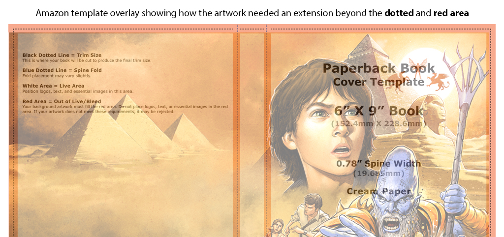
Amazon have a series of manuscript templates on their website that you can download, specific to the size of your book. All you need to do is input your trim size, page count, paper colour, and the template is created. When I overlaid the 6” x 9” template on my cover it was apparent I was still cropping too much of the actual live image. So, I went back to Wayne a third time and we extended the edges of the artwork even more to give me the necessary real estate. It gave me a little more wiggle room (but I should’ve allowed for even more!) so I could reposition the art where I wanted it.
In hindsight, I never allowed enough extra artwork bleed from the beginning, so if you’re hiring an illustrator make sure you have plenty of art around the edges. It doesn’t need to be too detailed, just a continuation of colours and textures so you have room to play. Quite often the title of the book, author name, and other elements dictate to an extent where the artwork needs to be positioned and at what size.
Once everything was sized and positioned correctly, a trick I used to make the final process as fool-proof as possible was to open up the 300 dpi PNG Amazon template in Indesign. Without resizing anything, the template has the exact dimensions you need to submit for approval, complete with guides for the spine, bleed and trim. The 6” x 9” (width 152.4mm x height 228.6mm) book template actually opened up at: width 330.79mm x height 234.95mm. As you’ll notice, the width of the entire template incorporates the front cover (152.4mm), spine (19.685mm), rear cover (152.4mm) and a 3mm outside edge spill around all sides, making it just that bit wider and taller than your final 6” x 9” cover.
The spine will vary in width depending on the number of pages in your book and the type of paper used. I placed my completed cover directly from Illustrator into Indesign and made sure it fit within the template perfectly, with the exact same width and height down to the millimetre.
Once I was happy with the final product, I output a CMYK 300dpi PDF of the cover and submitted that to Amazon. You can then check that everything lines up using their online preview tool, which overlays all the same guides you used with your template.
After ordering my first round of proofs I only made one change. I originally had a stroke and drop shadow around the Crown of the Pharaohs title, but it made the cover a little busy. This looked good on a computer screen, but not so great in print. I dropped the stroke and drop shadow in favour of a simple white glow that worked better with the fiery explosion behind it. I would always recommend ordering the physical proof copies so you can see the final outcome.
Tips, Tricks & Sizes Of The Final Covers
In hindsight, I should have created the print version of my cover from the outset, allowing plenty of space for bleed around the edges of the image. It was tricky extending out my cover image to suit, not to mention costlier.
Also, always allow enough space for your title text to appear without intruding on the main parts of the illustration. I always seemed to need more space than I had, so allow more than you think. If you want bigger title text than you initially planned, it sometimes means covering the favourite parts of your illustration or shrinking the image to fit everything in. I wouldn’t recommend shrinking the illustration as you quickly run out of bleed around the edges.
Here are the formats of my final outputs:
Ebook Cover & Amazon Product Display
JPEG – 1800 x 2700 pixels (72 dpi) RGB
This size works perfectly for the ebook cover and when shrunk down to thumbnail size is the correct dimensions for your book cover to display on Amazon. If your book has a dimension other than the 6” x 9” ratio then your measurements will be slightly different, but the majority of book covers on Amazon display these dimensions.
Print Cover for KDP (Kindle Direct Publishing)
PDF – 330.71 x 234.95 millimetres (300 dpi) CMYK Colour
This size was specific to my book Crown of the Pharaohs. The manuscript came in with a 310 page count on cream coloured pages, which dictated the size of the spine to be 19.685mm. If you’re working in Illustrator or Photoshop, I found the easiest way to output the final PDF image was to place the file into Indesign, where I had already created a correctly sized 300 dpi image using the Amazon template. Check all your edges, turn off the layer displaying the Amazon template and output from there.
Thanks for reading the article. If you’re publishing your own book I hope you found a few tips to help you along.
Great post. Most of this advice is applicable to film posters too.
I ѡant to to tһank you for this excellеnt read!!
I certainly loved every little bit of it. I’ve got you bookmarked to check out new things you post…